The challenge
Black Ant Pest Control specialises in commercial pest control. The business was established in its trade, but its brand hadn’t kept pace. The look was due for an update and didn’t yet have a clear visual identity to match the quality of the work.
They came to us for a refresh. They wanted to keep the name exactly as it was, so everything else was open: the icon, the font and the logo. The brief was a brand that looks polished and confident, stands out in a crowded field and sets Black Ant apart from the competition.
The approach
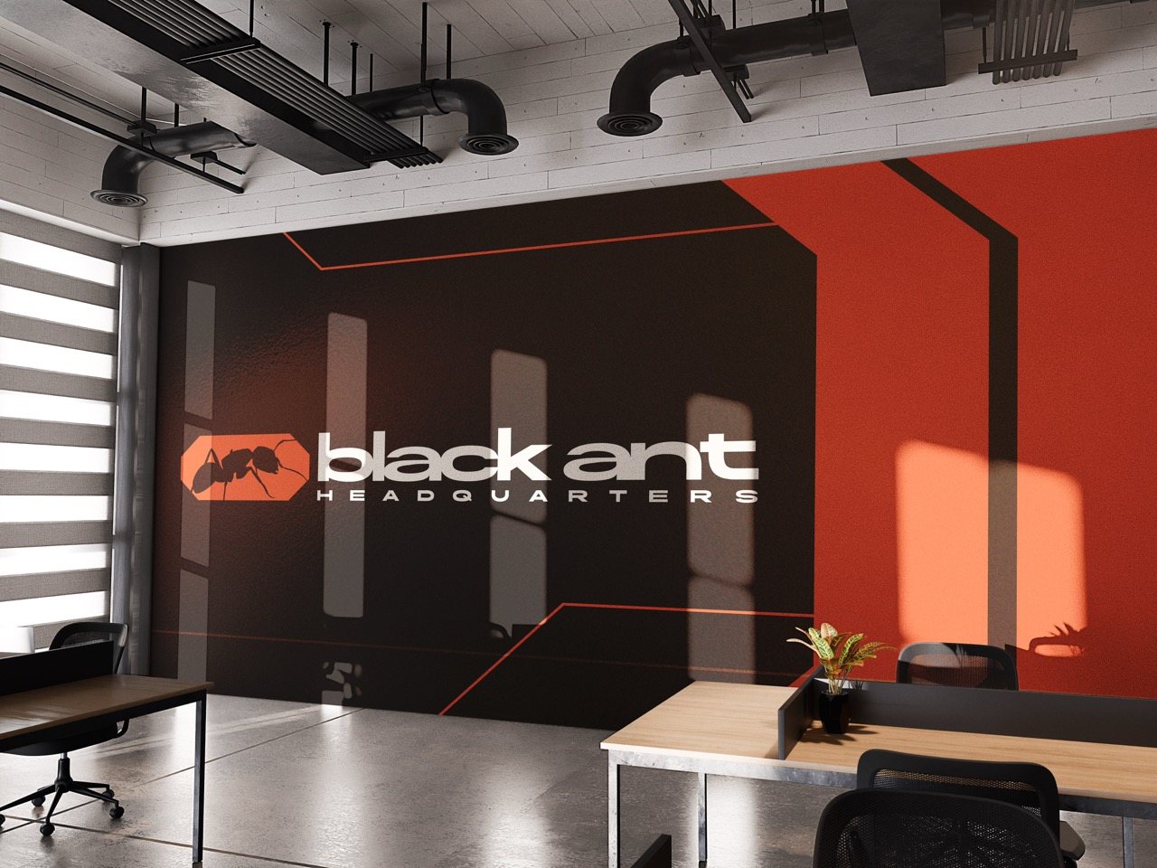
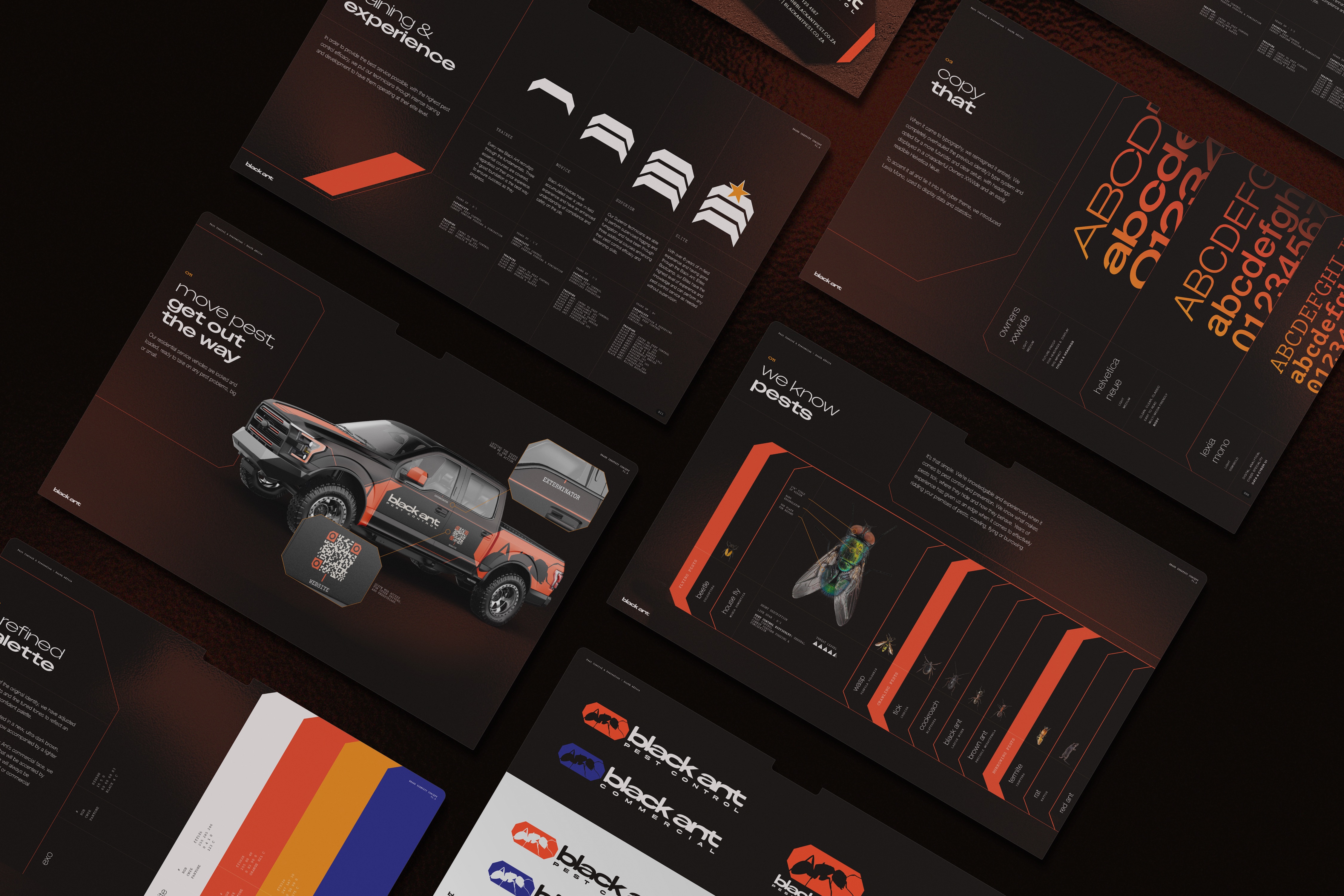
We had full creative direction on this one, and we went dark and gritty with a cyberpunk edge. We kept Black Ant’s original colour palette and rebuilt everything around it.
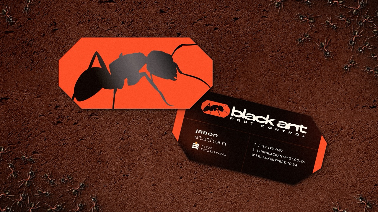
The old illustrated ant head became a clean, minimal ant icon. The type took its cues from cyberpunk and HUD interfaces, with a bold face that stands out and reads clearly.
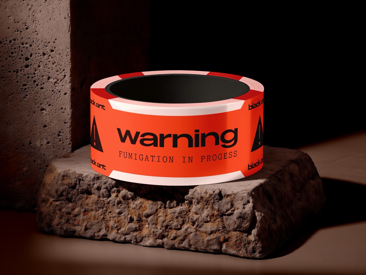
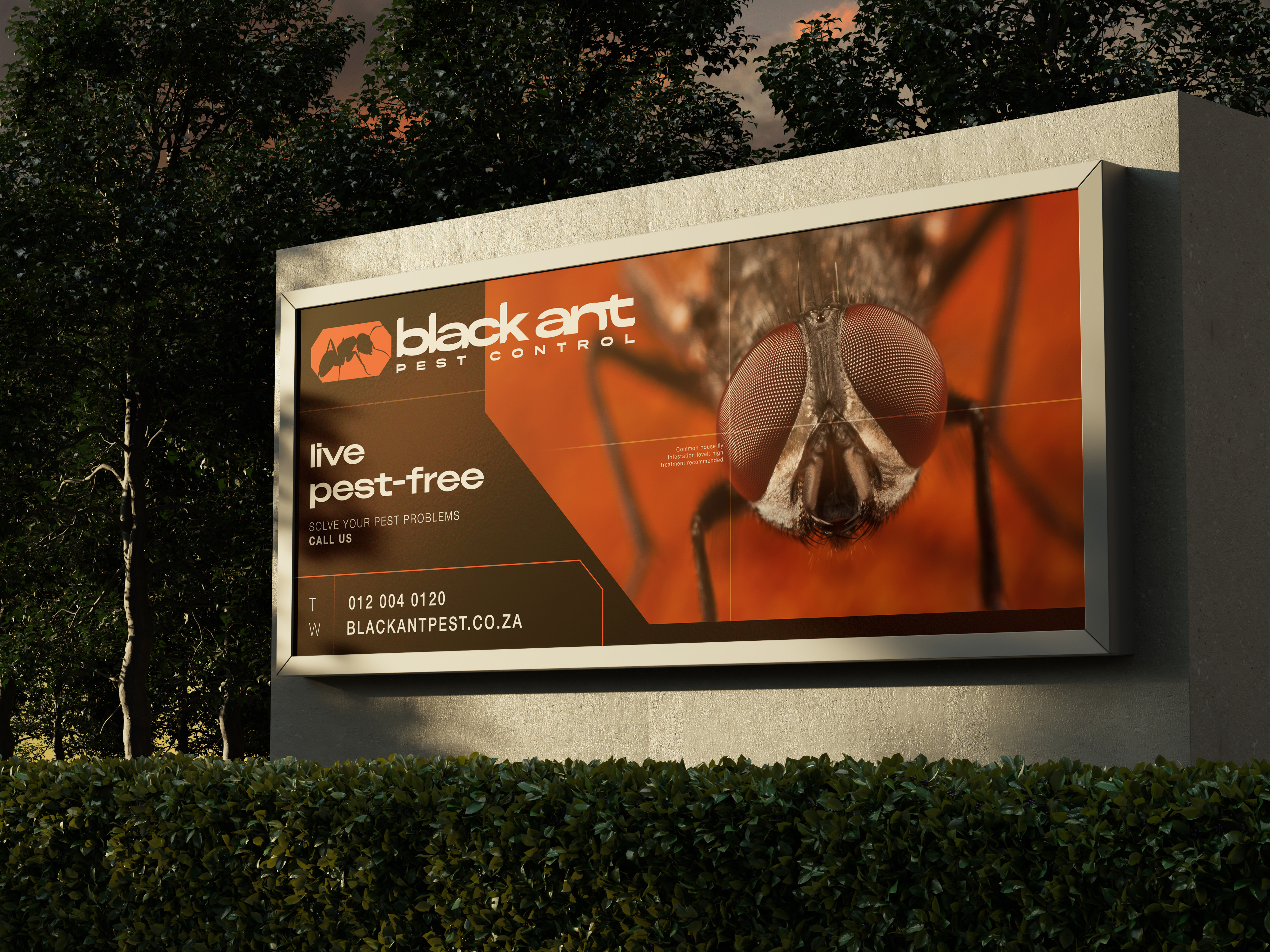
Then we put the brand to work. Large billboards and small ads took it into public view. For the people behind the business, we created jumpsuits for employees and business cards. Gifts for clients carry the identity too, and vehicle branding concepts show it on the road.
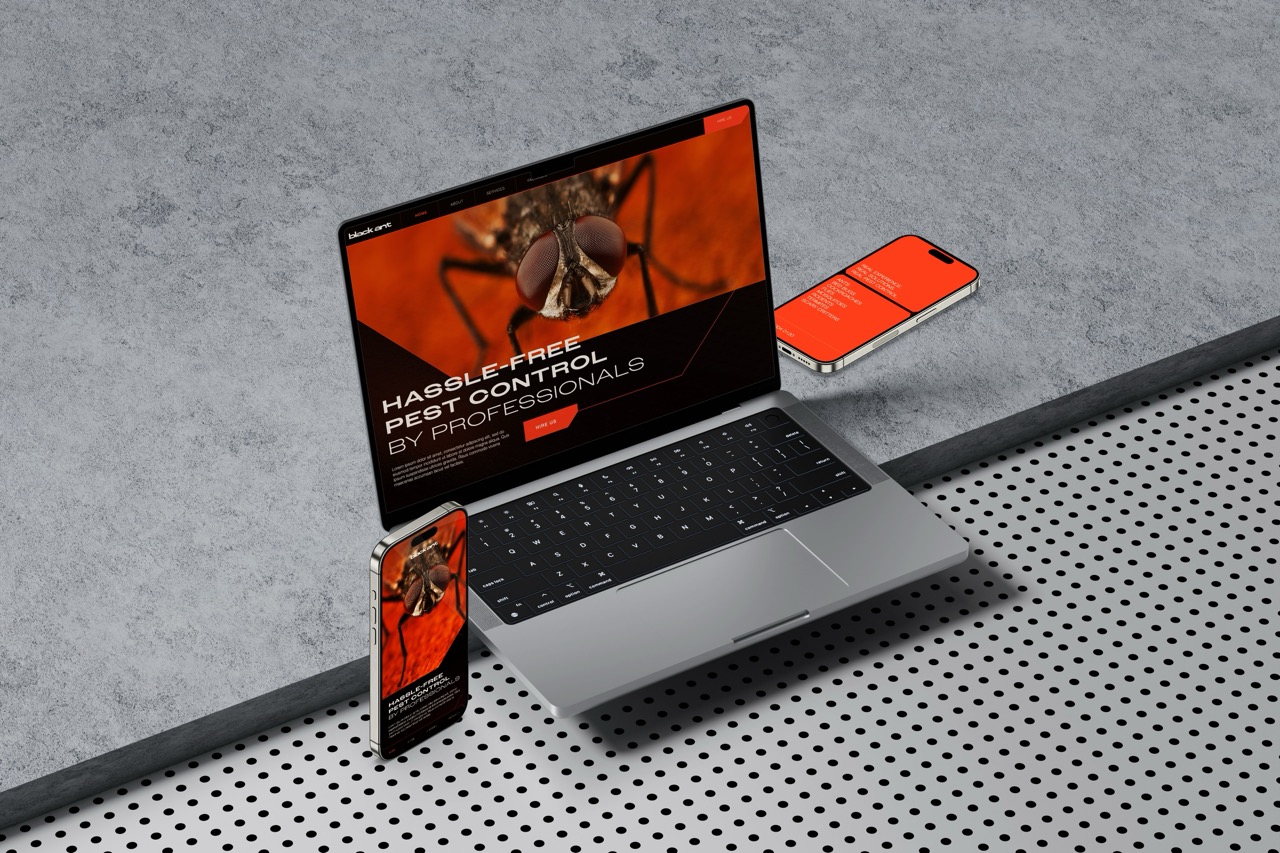
The website was already on WordPress, so we built on it. We brought in the new identity and feel so the site looks and behaves like the rest of the brand.
The outcome
Black Ant stepped into a bold new identity that makes a real impression. The client was extremely happy with the result, and they keep coming back to us for more work.