Energade Rebrand Concept

BrandConcept

Energade made its debut in 1993 as South Africa’s pioneering sports beverage. Thanks to its sponsorships of prominent organisations such as SA Rugby, Netball SA, and other significant teams, Energade swiftly gained recognition as a household brand linked to top-performing athletes, both male and female. By introducing a captivating array of flavours, Energade successfully crafted a continually improving and appealing product, catering not only to elite athletes but also to their enthusiastic fans and everyday sports enthusiasts.

Graphic Designer Maurizio Inward

Putting the Energy into Energade

In a market flooded with many sports drink brands, it’s crucial to stand out and provide a special brand experience that customers will remember. With so much competition, our goal was to offer a brand experience that would make a lasting impression on customers. This competitive environment set the stage for our rebranding efforts, all aimed at helping Energade become a distinctive and memorable choice in the sports drink market.

A New Premium Look

A rebranding initiative was essential, covering a spectrum from their logo to their packaging design, with the primary aim of establishing a distinctive presence in the market and capturing the attention of potential customers. In essence, the challenge at hand was to breathe new life into the brand’s visual identity, aligning it with the standards set by their competitors in the premium sports drink sector.

To embark on this transformative journey, we recognised the need for a comprehensive overhaul that would encompass every facet of their branding. The existing logo, while contemporary, lacked the essence of a premium brand that could command consumer loyalty in a highly competitive market. Additionally, their label design shared this same limitation, which further emphasised the necessity for a rebranding effort.

A Little Bit of This, A Whole Lot of That

Their existing logo, although modern, failed to convey a premium brand image. This observation extended to their label design as well.

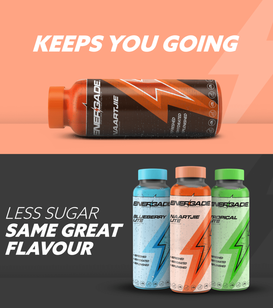
To address this issue, our approach was to maintain the design language of the label, including the slanted lettering, while infusing it with a more commanding presence. We transformed the lettering into all capital letters, employing a contemporary sans-serif font to achieve a sleek and bold aesthetic. We also introduced an additional element: a lightning bolt. This element not only conveyed a sense of “energy” but also provided a distinctive feature that set the logo apart.

However, the logo redesign was only the initial phase of our comprehensive overhaul. To complement the new logo, we needed to create an entirely fresh label design.

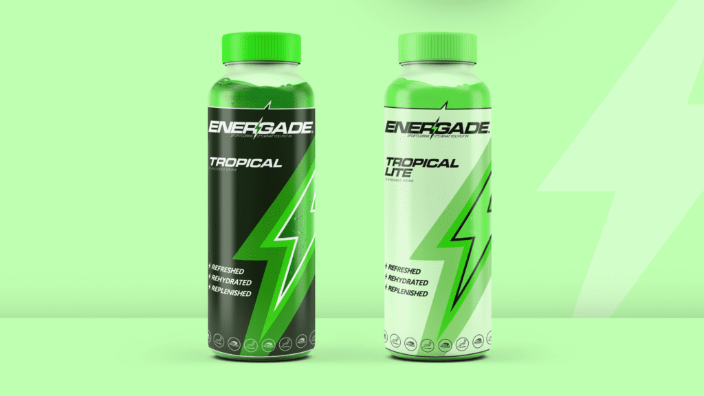
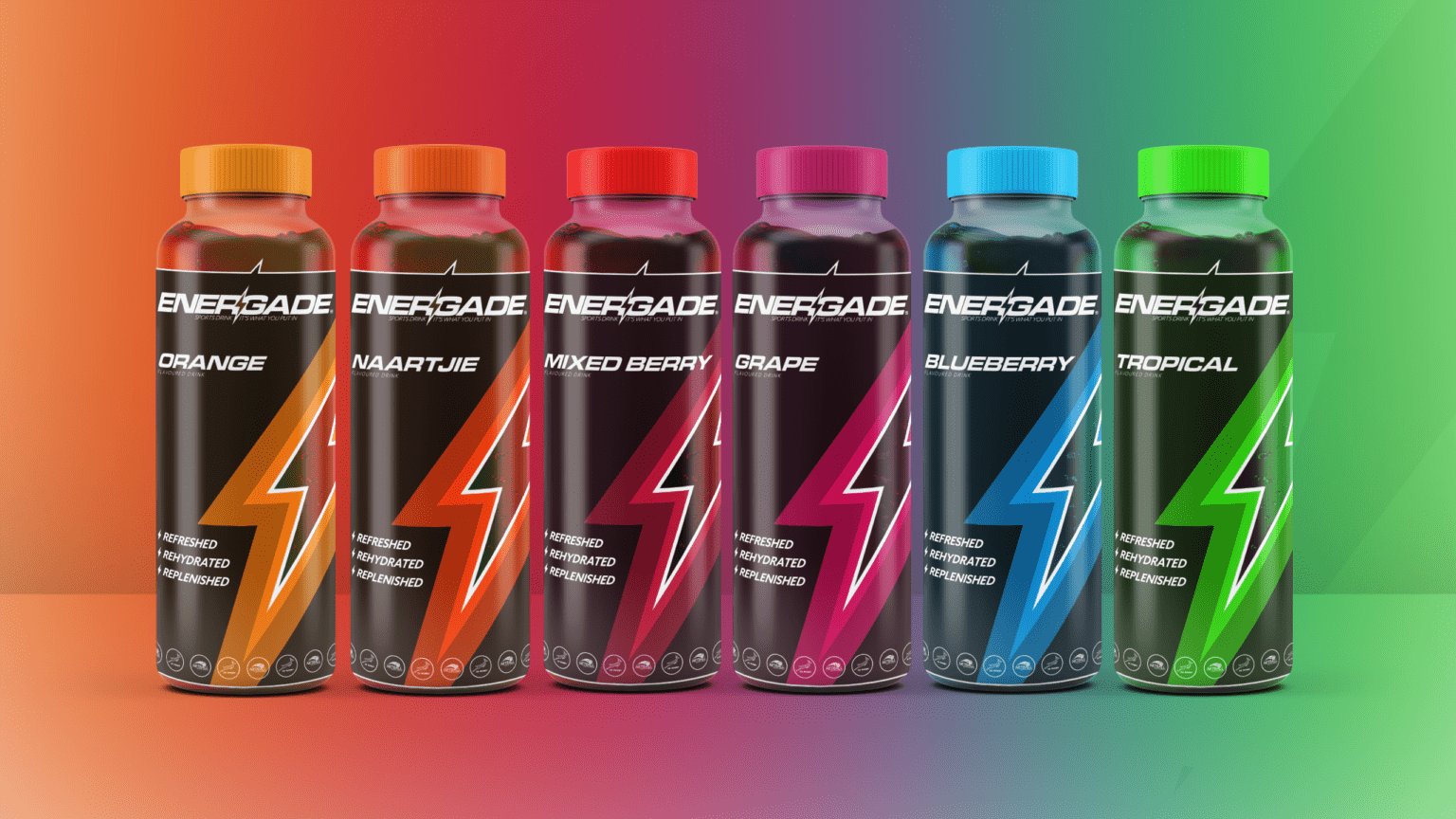
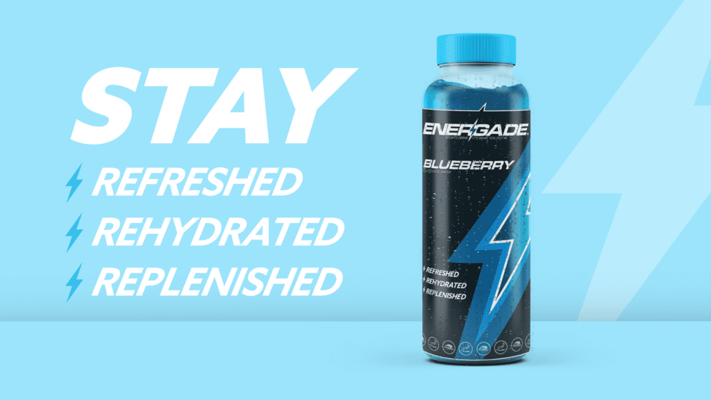
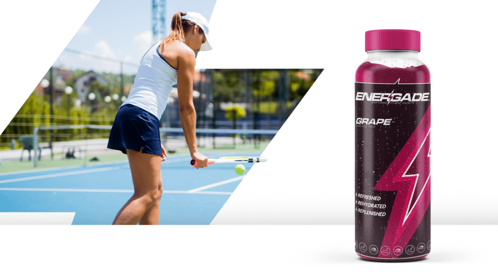
For their flagship drink label, our primary objective was to exude a premium quality. We began by enlarging the label to cover a significant portion of the bottle. The focal point of the new design became the lightning bolt element, left transparent to showcase the drink inside. The colours of the lightning bolt transitioned from a vibrant, saturated hue to a deeper shade of the same colour, with the darker hue occupying the largest section on the bottle, imparting a sense of luxury.

Energade, however, offers not just one type of drink but also a Lite version of their Sports Drink with reduced sugar content. For these bottles, we adopted a colour scheme inversion strategy. The transition now flowed from bright, vivid colours to a more subdued, pastel variation of the same colours. This visual transformation effectively communicated the concept of “lite.”


We’ve got the Energy

With the introduction of this fresh and premium aesthetic we are confident that our rebranding efforts have successfully met our intended objectives. This revamped look and feel not only breathe new life into the brand but also positions it as a formidable contender in the market. It exudes a distinctive appeal that can boldly stand toe-to-toe with any competition, fully embodying our envisioned achievements. This transformation not only elevates the brand’s allure but also bolsters our position within the fiercely competitive landscape of our industry.

What They Say About Working With Us

Concept by MI Creative